PlutoPay - UX / UI for a financial management App:
PlutoPay is an app where all your financial data comes together. It gives you more overview and control over your money and makes financial management easier.
About the Project
The Challenge
To keep track of your financial life, you have to use many different services so that it is difficult to overview everything at the same time.
The Process
A complete development of the project, from the initial discussion of the idea to a high fidelity prototype.
The Goal
PlutoPay allows you to integrate your existing banking and investment services and combines them in one place. It also offers additional features to help you identify and improve your habits or share money with your friends.
My Role
UX Design student - The project was part of my UX learning process at a CareerFoundry Course
Timeline
8 Months
Tools
Pen & Paper / Adobe XD / Illustrator
Target Audience

- Students and apprentices would be more likely to use the app for its social features
- Young adults who are fresh in their careers can use the app mainly because of the planning features and the ability to set up saving goals or budgets
First User Research
I did different types of user research before starting the design process to better understand what users want and need:
- Individual in person interviews where I interviewed the participants regarding behaviour/attitudes, needs/goals or frustrations points
- Survey was able to address a larger group and mainly explored the participants' banking behaviour and financial habits

Insights

Following insights were gained
- Saving is sometimes compared to cutting into your quality of life
- When an app sets hard limits, it can make you feel patronized or not strong-willed enough
- Saving is about very personal goals, but they are similar in sum and mainly have to do with the feeling of security and stability in one‘s life
- It will probably be very difficult to move users away from card payments to another method
- There are different inner beliefs that influence the way we deal with money
- Almost everyone sometimes shares money with others - everyone also knows the problems that arise and fill this actually nice gesture with negative feelings
Important features
- Simple and fast handling
- Good overview
- Possibility to check as many accounts as possible
- Buyer protection
- Desktop access
- Transfer money
- Information on financial topics
- Have an overview of all accounts used
- Not having too many accounts

Meet Dan - User Persona

Demographics
- 22 years old - Lives in Hamburg
- Single
- At the end of his apprenticeship as a mechatronics technician
Behaviours
- Has a pretty settled job with relatively good salary
- Starts the day comfortably with a black coffee, then works his 8 hours and gets his lunch ready after work
- Likes to play poker for fun with friends, to meet for a drink or to play a game on his Playstation
"I appreciate knowing what's coming up in life and feeling like I've provided for all possible scenarios."
Learn more about BenjaminDesign development
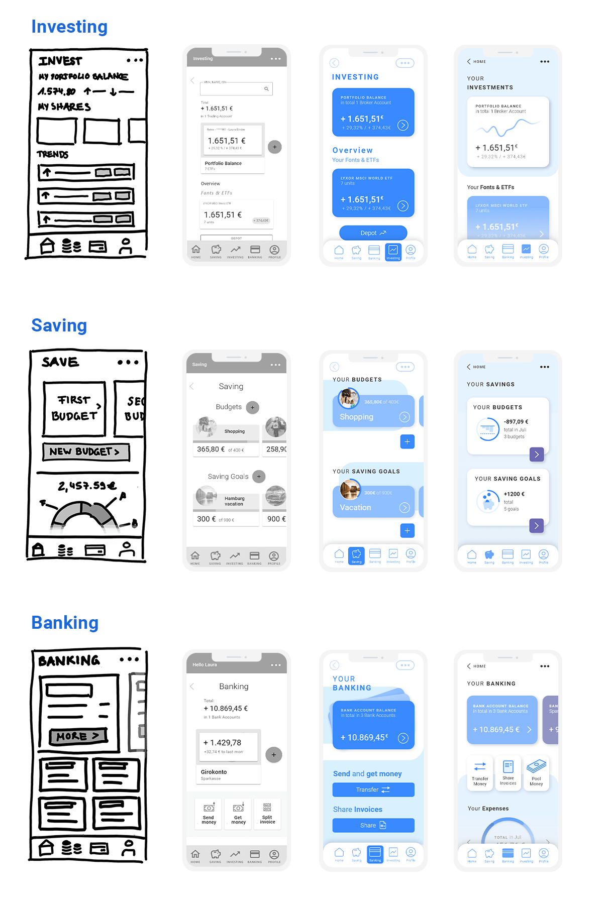
A simplified presentation of 3 important features – from low fidelity over mid to high fidelity and with a further design revision

Final Design
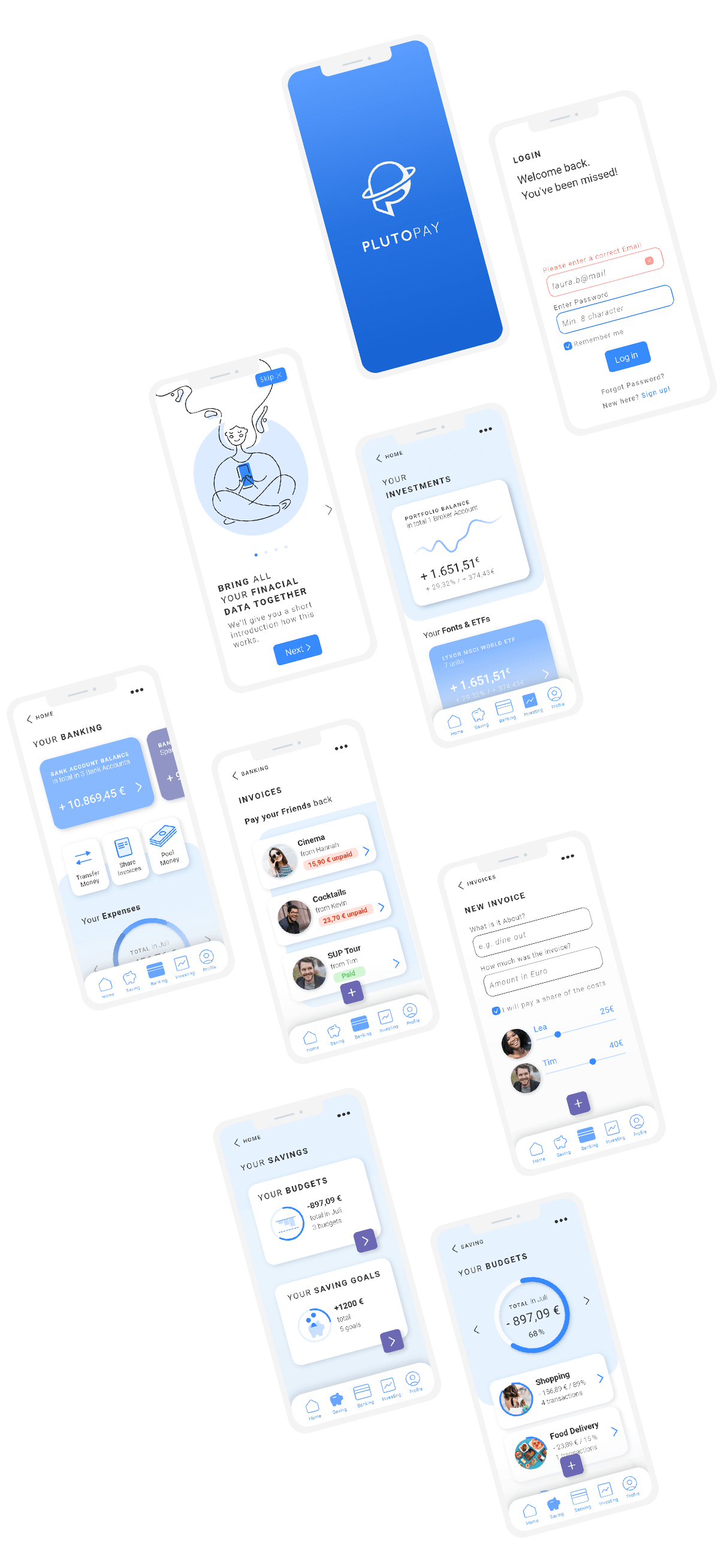
After doing some testing with the previous prototypes and making a few accessibility adjustments, I came up with the following final design.

